Designing our Magazine
Our completed ancillery task - Magazine
Our completed ancillery task - Magazine

The masthead of our film - Tug of Love, was edited to show consistency throughout our production, in regard to colour scheme and images used throughout. In the centre of the title we used a blue lens flare which was similar to the lens flare used in our studio ident. This was done to show a constant significant image that references in the magazine and in the studio ident. We also kept a colour scheme of black, red and white to express a consistent theme that occurs in the poster and the magazine. when considering the use of props the teddy bear used in the trailer, was also used in the poster and magazine to ensure the genre and synopsis was always made clear to the target audience.

 When taking photographs for our magazine front cover we wanted our image to be simplistic, due to researching professional magazines. After taking our image we edited the background using Photoshop elements we did this by cropping around the female in the main image and created a grey background using paint. We decided upon this because in most film magazines the background is very plain so that the audience i draw towards the main image which is usually of a main character as they are considered the most identifiable in reference to advertising the particular film or in our case the trailer for the film.
For mine and Nicola's ancillary task of a magazine, we wanted to find a font style that would come across as simplistic yet effective. therefore, we found a websites called my fonts that enabled us to search through various types of fonts to choose the exact one we were looking for. We typed in various key words such as bold, title, headline etc to explore various typographys. After a long time of searching we found exactly what we wanted, (the font above). the reason we decided on this particular font was because firstly, it was very simplistic and displayed in bold, and secondly, it gave off a professional feel to it.
However, once showing the masthead to our peers we were informed that it wasn't very eye catching, so we decided to keep the size of the 'X' however, changed the actual font of the 'X' as we noticed it was quite different to the rest of the mast head. Nicola and I also though that by editing the colour of the 'X' to a bright red would link with the rest of the colour scheme on the magazine. Through following codes and conventions of professional magazines, most mastheads were either behind the main image, in front or slightly out of context to create more of an edgy feel therefore, we decided to change the positioning of the 'X' so that it was now displayed on a diagonal slant in order for it to appear more unique and eye catching drawing in a range of audiences.
Developments


Research into Film Magazines
Total Film
Total Film is one of the biggest and most recognised film magazines. It is based in the UK and sells an issue of the magazine monthly for £3.99 or £37.99 for one years subscription. The magazine was launched in 1997 and is published by Future Publishing. It offers cinema, DVD and Blu-ray news, reviews and features. Total Film is available both in print and on IPads. It has been released in other countries such as Turkey, Russia, Serbia, Croatia, Indonesia and many others.

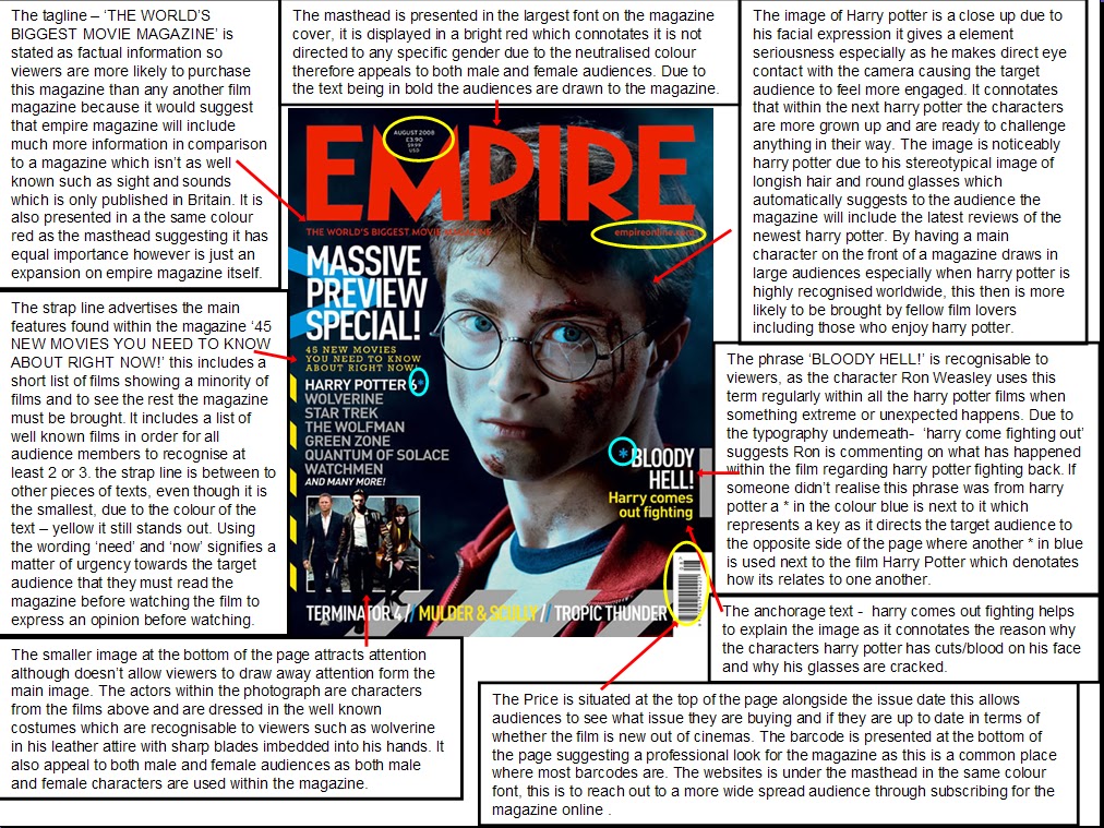
Empire
Empire is a film magazine which advertises, and gives reviews of the latest movies which are out in cinemas, it also can include interviews with directors of specific film and the actors/actresses in the movies. It is published monthly by Bauer Media. The first issue was released in July 1989 and is now recognised to be the biggest selling film magazine is Britain and has been published in America, Australia, Turkey, Russia and Portugal. This magazine is a helpful guide to target audiences whom would be intrigued by various genres of films form comedy/romance to action/thriller, it is found that the range of ages to purchase and read this magazine are between 15-44. Through reading this magazine would help decide a persons decision on whether a film they would like to watch would interest them and meet their standards. The magazine costs £3.99 unless you would prefer to pay yearly which would work out at a better price for only £2.50 per month.
Our completed ancillary task - Poster

We edited the typograghy of our title 'Tug of Love' so it no longer was displayed in bold, this improved the poster as it made the typograghy appear handwritten relating to the genre of our production.
Developing our Poster


through feedback from our target audiences an issue that arose was the uncertainty of whether the title was 'A Conflict of Custody' or 'Tug of Love', due to the size and style of the typography used. Furthermore we altered the positioning and size of the piece of text so it was clear which was the masthead and which was the tagline. through research we realised usually a colour scheme is used throughout the magazine, therefore we changed the colour scheme so the poster would fit the style of our film - a drama. After researching professional posters we decided to remove the logo's of facebook and twitter as only very few published film posters advertise through social networking sites.
We used pic monkey to adjust the lighting of the balloon making it a more vibrant red

We adjusted the brightness using pic monkey

Our Original image for our poster


In preparation for our film night, we placed our completed posters around school.
Research into posters
The Dark Knight

New Moon

My Sister's Keeper

No comments:
Post a Comment